I visited an art gallery a couple of months ago and whilst in the gallery's shop, my boyfriend pointed out a book that he thought might be of interest to me. The book was about Salvador Dali (I can't actually remember which one it was) and I was told that Freud had inspired many of his painting and art work. I didn't buy the book because as you can guess it was quite overpriced. Instead I found a cheaper version on the Internet (see below for details) which seems to be equally informative.
Salvador Dali (1904-1989) was an artist who played a great part in the Surrealism art movement. Surrealism was invented by Andre Breton and was first used to express a poet's subconscious mind through the use of words and sentences. However, in the early 1920s, Breton challenged artists to use Surrealism in paintings to discover what the visual outcome would be. Although Dali is probably the most famous Surrealism artist, he was actually kicked out of the Surrealist group because of his use of inappropriate material which offended many people. He was actually born in Figueras, Spain, however, he spent a lot of his time in Cadaques. Cadaques, a beautiful coastal town in Spain, was the setting that repeatedly appeared as the background in Dali's paintings, most commonly featuring in his earlier work as his family and himself would spend a large quantity of time holidaying in this area when he was younger. His reason for choosing this area instead of his place of birth was not just because of the heavenly appearance that it sparks, but because one of his main muses was found here: it's rocks.
This may sound strange, however, if you look closely at the paintings he created earlier on in his life, this will become clear. This is Dali's paranoiac-critical method. In other words, remember when you were younger, and you'd lie on the grass gazing up at the clouds and you'd make them out to be faces or giraffes or elephants? Well this is what Dali used to do with these gigantic, mountainous rocks. In the context of the paranoiac-critical method, the rocks are an object with no mechanical meaning, however, when looked at, Dali viewed phantom images which are the results of his subconscious mind, which is where the surrealism twist takes place. The shapes you can see within the clouds can be known as 'phantom images' as the animals or faces (or whatever they may be) aren't physically there, only clouds are present. These phantom images appear in paintings such as 'Swans Reflecting Elephants' and 'Metamorphosis of Narcissus'.

Above is 'Swans Reflecting Elephants'. This oil painting contains three swans who are staring into the lake, however their reflection turns their high necks into elephants' trunks. The setting is in Cadaques which holds a chaotic atmosphere with rough colours and clouds that look like birds compared to the calming colours and stillness of the lake. This indicates an unlikely pairing in both the contrasting landscapes and the animals (swans are delicate and calm and elephants are heavy and loud). The double imagery creates paranoiac and phantom images out of the landscape. Maybe the elephants belong to the chaotic setting and the swans in the reflective lake?
Anyway, I don't want to write too much about his paintings.
Salvador Dali thought of himself as a celebrity. He did want to be famous and wouldn't settle for anything less. A lot of the other artists picked up on this fact and the furious Andre Breton nicknamed Dali 'Avida Dollars' which is an anagram of Dali's name and translates to 'eager for money'. Dali would never refuse offers from people who could bring him fame and fortune. For instance, he collaborated with Disney, made a number of Surrealistic cartoons, and he collaborated with Elsa Schiaparelli.
Elsa Schiaparelli was influenced by the Surrealism art movement. Dali and herself collaborated in the late '30s to design a new collection. The outcome was a shelf suit, a shoe hat and a lobster print dress and of course in the late '30s nothing like this had ever been produced.

To the left is the Schiaparelli bureau-drawer pocket suit dress. The inspiration for this was sourced from Dali's collection of art which includes 'The Anthropomorphic Cabinet', 'The Burning Giraffe' and 'Venus de Milo with Drawers'.

Above is Dali's 'The Anthropomorphic Cabinet'. The artist was continuously inspired by Sigmund Freud throughout his life and often made references to the famous neurologist through his art. This particular collection of art was additionally borrowed from Freudian theory. The drawers are said to represent an unconscious image of draws within the human body which waft out the 'countless narcissistic smells'.
 Another of the Dali/Schiaparelli creations is the shoe hat. This idea came from a photograph of which Dali's wife, Gala, took of the artist. In the photograph, Dali was wearing a shoe on his head and the other on his shoulder. Therefore Dali must have thought 'why not make a shoe hat?'. This is another example of where Dali has combined two unlikely features and made them work.
This photograph has been sourced from the V&A museum's website. The creation is actually held at within the museum in London.
http://collections.vam.ac.uk/item/O183849/shoe-hat-hat-schiaparelli-elsa/
Wearing a shoe on your head had never been done before, and it was looked upon as being obscure and extremely weird. Maybe it still is quite weird, however, I believe that this design created a new trend within fashion that has turned into something huge. Designers today are able to be a lot more flexible within their designs. Take Philip Treacy for example. His designs are so crazy and innovative that they are amazing. One of his most contradictory and famous designs would be the hat that he made for princess Beatrice to wear at the Royal Wedding. Google the designer and you'll come across his extended, futuristic collection. Treacy has even made reference to Dali himself, creating a lobster hat in which Lady Gaga has previously been seen out wearing to a red carpet event.
 One of Dali's most popular pieces of art in the 1930s was the Lobster Telephone. The object, again, combines the unlikely combination of a telephone and a lobster. This is said to have sexual connotations and desires, however, it was quite unusual within the '30s.
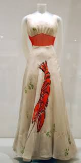
The lobster was reinvented in the form of a dress. The floor-length evening dress is made from white silk. Schiaparelli wanted Dali to hand paint a lobster on to the skirt. And so he did. The lobster is positioned in the centre of the skirt coming from the crotch and reaching downwards towards the hem. Again this may symbolise a surrealistic vision of secret desires, however the dress became extremely famous.
Today, motifs are widely used within fashion design. Especially animalistic ones. For instance, Dolce and Gabbana have embedded owls into their A/W '14 fairy tale inspired collection and Kenzo's famous tiger motif repeatedly appears on the brand's garments.
The biggest trend of this season tributes to Dali's artistry. Moschino's Jeremy Scott brought food to fashion. The McDonald's edited logo has been constantly blogged since the a/w '14 show in February. Scott turned the famous yellow 'M' into a curved, Moschino-ised letter.
Anya Hindmarch has additionally used the same sort of approach within her recent designs. She has embedded the tiger from Frosties cereal on to one of her blue handbags as well as the cockerel from the Cornflakes' advertisements.
King of fashion Karl Lagerfeld has also paid tribute to Dali. He merged food with clothes at his a/w '14 show for Chanel was set in a fictional supermarket selling Chanel labelled food products. Combining the food industry with fashion is an unusual pairing which, again, is what Dali used to do.

Another of the Dali/Schiaparelli creations is the shoe hat. This idea came from a photograph of which Dali's wife, Gala, took of the artist. In the photograph, Dali was wearing a shoe on his head and the other on his shoulder. Therefore Dali must have thought 'why not make a shoe hat?'. This is another example of where Dali has combined two unlikely features and made them work.This photograph has been sourced from the V&A museum's website. The creation is actually held at within the museum in London.
http://collections.vam.ac.uk/item/O183849/shoe-hat-hat-schiaparelli-elsa/
Wearing a shoe on your head had never been done before, and it was looked upon as being obscure and extremely weird. Maybe it still is quite weird, however, I believe that this design created a new trend within fashion that has turned into something huge. Designers today are able to be a lot more flexible within their designs. Take Philip Treacy for example. His designs are so crazy and innovative that they are amazing. One of his most contradictory and famous designs would be the hat that he made for princess Beatrice to wear at the Royal Wedding. Google the designer and you'll come across his extended, futuristic collection. Treacy has even made reference to Dali himself, creating a lobster hat in which Lady Gaga has previously been seen out wearing to a red carpet event.
The lobster was reinvented in the form of a dress. The floor-length evening dress is made from white silk. Schiaparelli wanted Dali to hand paint a lobster on to the skirt. And so he did. The lobster is positioned in the centre of the skirt coming from the crotch and reaching downwards towards the hem. Again this may symbolise a surrealistic vision of secret desires, however the dress became extremely famous.
Today, motifs are widely used within fashion design. Especially animalistic ones. For instance, Dolce and Gabbana have embedded owls into their A/W '14 fairy tale inspired collection and Kenzo's famous tiger motif repeatedly appears on the brand's garments.
The biggest trend of this season tributes to Dali's artistry. Moschino's Jeremy Scott brought food to fashion. The McDonald's edited logo has been constantly blogged since the a/w '14 show in February. Scott turned the famous yellow 'M' into a curved, Moschino-ised letter.
Anya Hindmarch has additionally used the same sort of approach within her recent designs. She has embedded the tiger from Frosties cereal on to one of her blue handbags as well as the cockerel from the Cornflakes' advertisements.
King of fashion Karl Lagerfeld has also paid tribute to Dali. He merged food with clothes at his a/w '14 show for Chanel was set in a fictional supermarket selling Chanel labelled food products. Combining the food industry with fashion is an unusual pairing which, again, is what Dali used to do.
Did I mention the Dali designed the Chupa Chups lollipop logo? The idea has the combination of flowers and food which was an unlikely concept in the 1960s, however, it worked because it was different, and other than the bright colours featured on the sweet wrapper, the flower attracted many purchasers and made the product sell.
This is similar to the food/fashion trend this autumn/winter. The idea is quite contradictory as food and fashion do not go well together for a few reasons: one being that the media spotlights thin models in being 'too skinny' and 'possessing eating disorders' (which I disagree with as I'm sure they are healthy and lucky for them, have high metabolisms) and that to make clothes look good, you shouldn't eat fatty foods such as McDonalds (again, I don't agree with this although I'm not McDonald's biggest fan). But maybe fashion is changing?
To conclude, Salvador Dali has had an enormous influence on the fashion industry, and in many cases, all creative industries. He gave artists and designers the flexibility to create whatever their subconscious tells them to. The weirder, the better, as more people continuously question why it has been done until it has found a place in society and it's looked upon as being normal.
Dali by Gilles Neret (Taschen) was the book that I have been reading and it taught me about Salvador Dali's work.


